Jems: Designing a jewelry e-commerce marketplace

The Project
Project Goal
Design a responsive e-commerce marketplace for a new jewelry brand that features up and coming designers.
The website should be easy to use and allow customers to browse through, search, and filter products, as well as learn about the designers in the marketplace.
Jem’s brand and website should be simple and modern as to not distract from the brand and pieces of the designers within the marketplace.
Brand Overview
Jems is a new marketplace for up and coming designers to sell their jewelry. Think of it as an arts fair, except online. Jems features jewelry from all kinds of designers and caters to the modern millennial woman.
Role
Product Design, UX/UI Design, User Research, Information Architecture, Branding, Prototyping, Usability Testing
Tools: Figma, OptimalSort
The Process
1. Empathize
Research and understand how jewelry is bought and sold online.
2. Define
Get specific on what needs to be designed and how it’ll be organized.
3. Ideate
Based on learnings and project goals, start designing a website and brand for Jems.
4. Prototype + Test
Create prototype to test the designed e-commerce experience and observe users in real time.
1. Empathize
Overview
To get a better sense of the jewelry industry and how people shop for jewelry, I had to understand it from both a macro and micro level. Understanding the industry growth, as well as trends, would immerse me in the world of jewelry and help me learn more about general buying habits, successful brands in the space, and what a jewelry e-commerce experience looks like.
To dive deeper, I needed to speak with women who buy jewelry on a regular basis. Using secondary research, competitive analysis, and user interviews, I will get a better understanding of how and why jewelry is purchased, as well as the memories and experiences that come with each piece.
- Secondary Research + Competitive Analysis
- Primary Research: User Interviews + Findings
- Affinity Map
- Persona
Secondary Research + Competitive Analysis

For many women, jewelry is an important and special part of their wardrobe. Accessories make the outfit, right?
Even though there’s plenty of e-commerce stores that sell jewelry, women still look to influencers and social media ads to find unique jewelry that fits their budget and won’t be seen on every other woman in their office or social circle.
At the same time, consumers are demanding to know more about the products they purchase. From how it looks on them personally to where materials are sources to detailed information about the people who actually beaded their necklace, consumers are getting smarter about their purchasing.
Competitive Analysis + Provisional Personas
In order to get a better sense of the competitors in the jewelry marketplace space, I reviewed sites such as Local Eclectic, a jewelry marketplace that focuses on modern vintage, Etsy, a staple in the handmade craft and jewelry world, and Maker’s Market, a craft marketplace with brick and mortar stores. These three sites allowed me to get a better sense of how the brand of the site and the creator’s brand could exist side by side, how designers were highlighted on product pages, and general best practices when it came to marketplaces.
I also reviewed sites such as Aurate, a popular jewelry maker that focuses on high quality, yet affordable pieces, and NOVICA, a marketplace for goods made all over the world. Identifying theses secondary competitors provided additional insight into the ideal shopping experience, as well as references for common design patterns.
Primary Research: User Interviews
I conducted a total of five user interviews surrounding women’s jewelry buying habits, with a particular focus on their expectations, desires, and frustrations with shopping for jewelry online. Participants had a varying relationship with jewelry, in terms of when they buy it, how much they spend, and how much jewelry they wear on a daily basis.
These interviews helped me learn more about the expectations that consumers have when purchasing jewelry online when it comes to product information, photos, and information about the brand. They also helped me learn more about the types of jewelry that consumers are likely to purchase online.
- 5 participants
- All female
- Age range: 28-31
- All participants lived in major cities (SF / LA / NYC / Austin
- All participants wear jewelry on a regular basis
User Interview Findings
Goals + Needs
Users want to know the quality of a piece.
Users want to know how jewelry will look on a person.
Users sometimes just need to check a box when it comes to jewelry.
Users want to have a connection to their jewelry.
Motivations
Users need to buy something basic at an affordable price with decent quality.
Users want a special piece as a gift for them/others.
Users want to understand the story behind the jewelry.
Pain Points
Users have multiple vetting sources for independent designers.
Users want to have an individual style, but want affordability.
Users don’t really just search for unique jewelry.
Users want to have a connection to the maker.
Opportunities
Offer a place to find basics and unique jewelry.
Showcase jewelry through the consumers eyes.
Highlight the maker’s story on the product page.
Affinity Map
Upon reviewing transcripts from my user research, I began to draw out key quotes from each participants. From there, I used Trello to organize a list for each participant. With all participant quotes in the board, I then began to create lists based on themes that were popping up for at least two of my participants. From there, I create an affinity map to see key themes across the board.

Affinity map based on key themes
The Persona
With the research to date as my guide, I created the persona of Rita, a “fashionable deal finder” who appreciates good quality, yet affordable fashion and accessories. She has a fun sense of style and enjoys incorporating basics she buys at Madewell with her subscription pieces from Rent The Runway. She’s always likely to be wearing a piece of jewelry she’s purchased on her travels.
From my research, I learned the demographic I was aiming for are avid online shoppers, even if they don’t actually purchase anything. They’re just as likely to click through on an Instagram post and purchase as they are to diligently read through reviews. These consumers are smart, but they love to try out different styles, brands, and looks. While the demographic may have a few favorite brands as staples, their wardrobe and jewelry collection is filled with pieces from all over the world and the internet.
Click to enlarge
Empathy Map
Based on the user research, secondary research, and the persona of Sara, I created an empathy map to further understand the world of my user. The empathy map contains themes gathered from the research, pulled quotes from the user interviews, and a deeper understanding of the women who shops for jewelry on Jems.

2. Define
Overview
Using the research and learnings from the Empathize phase, I began to dive into how best to set up the site experience. Defining the information architecture, page and feature requirements, and creating user flows helped set the tone for how Jems could be seen and used as an e-commerce marketplace right off the bat.
- Card Sorting Exercise + Summary
- Sitemap + Information Architecture
- User Flow
Card Sorting Exercise
Overview

Similarity Matrix for Jems Card Sorting Exercise
To get a better understanding of how people categorize jewelry products, I conducted an online card sorting exercise. This study asked users to organize cards with various product names (earrings, rings, necklaces, bracelets, and custom items) into different categories that they created themselves.
Online card sorting
Open sorting study
10 participants
30 card variants
All cards were jewelry product names, such as:
Uma Hoops
Tabitha Collar
Ovate Ring
Findings
In reviewing the Similarity Matrix, most participants grouped jewelry pieces based on type of jewelry (ring, earrings, bracelet, necklace, etc). What was really interesting is that earrings in particular brought more detailed categorization (hoops, studs, etc.)
Where there is some confusion is when an piece has an alternative name (i.e. collar or threader) and fits into a separate category, but it’s not obvious unless a user knows about those types of pieces.
Based on the card sorting study, it will be important to create an opportunity for users to search or filter by a secondary type of jewelry (i.e. earrings: hoops) so they can get more specific in their browsing experience without too much frustration.
What will be key is not using terminology that isn’t well known (i.e. threaders) and keep those types of pieces in their umbrella category (earrings).
Standardized Categories

Sitemap
Because Jems is a marketplace, it was also important to give the designers a place within the site. The Shop By Designer navigation item allows visitors to shop all designers, as well as view new or trending designers, finally landing on a designer’s page.
Using the data collected in the card sorting exercise, plus research on other jewelry websites and marketplaces, I created the sitemap. I wanted it to be simple upon landing as a lot of marketplaces can feel very overwhelming. The jewelry is categorized by type and users will be able to filter on category pages. To lean into relevant groupings such as Basics or Zodiac, I created Collections so users could browse based on what they’re looking for without searching.

User Flows
The user flow for the Jems site is based on the initial introduction of Jems to a user. The flow follows a user through the main decision point of how they want to find a designer or jewelry, all the way through the purchase flow. This flow helps us understand how a user could interact with the site and any potential drop off points.
Click to enlarge
3. Ideate
Overview
Now that we know more about who our user is and the overall architecture of the site, it was time to start building the Jems website and brand. I began by creating sketches for the homepage, thinking through how the Jems value prop, pathways to shop, and the designers’ stories could be highlighted on key pages. From there, I created responsive wireframes and a wireframe prototype to test if the low-fi site design and architecture was as users expected it to be.
Once the wireframes were solid, I began to create the Jems brand and UI guide to use in the final phase.
- Sketches
- Responsive Wireframes
- Low-Fi Prototype + Usability Test
- Branding + UI Kit
- Hi-Fidelity Designs
Sketches
Sketching helped me identify the different ways the various modules could flow together, as well as some initial concepts for interaction design. Since the entry point to Jems could likely be the product page, it was important to me that the product page template highlighted the value prop of Jems, had a spotlight on the designer, and also showed other relevant products.
For the product page, I also took a lot of cues from the expectations that interviewees communicated in user research. The need for a variety of photography, information on the designer, and a clear path to purchase or learn more about the product were primary goals for this page.

Responsive Wireframes
In refining my sketches and creating these responsive designs, I returned to the goal of showcasing the breadth of the marketplace’s products, highlighting the designers, and providing a clear path to purchase. Through my user research, I heard that it was important for users to see various products right off the bat, so the hero and ‘Take a look’ module allow the user to explore products, while not getting to overwhelmed.
From there, the story is about educating the user on the brand and the designers, while allowing for additional paths to explore jewelry by category. The ‘Explore by budget’ was a module I felt was important to include because of the persona’s “deal finding” attitude. Plus, with the price buttons, anyone shopping for a gift could easily find products that suit their budget.
The homepage ends with a shoppable Instagram module nad press module to add deeper validation of the brand.

Low-Fi Prototype + Usability Test
To make sure my use of e-commerce design patterns, as well as new patterns, made sense to the user, I decided to do a usability test with the low-fidelity wireframes.
One of the main goals was to understand how a user would search and find products. This prototype specifically looks at how a user might find a specific pair of hoops. This prototype allows for 3 different entrance points to the product page: 1) via the nav bar, 2) via the collection tile, and 3) via the second module on the page that allows the user to toggle between different categories. I created the additional pages and hover states in Figma and then created the prototype by connecting all necessary pages.
Low-Fi Prototype Usability Test Findings
Task Completion Rate
Overview
Overall, the Jems wireframes matched the expectations of the user. To my surprise, a lot of users utilized the category tabs (jewelry type + icon) in the second module instead of using the navigation.
In this test, users doubled down on the importance of a variety of images to showcase the product by itself, on a model, and more, as well as how reviews and having the ability to search or filter reviews was important to them. Additionally, being able to see related products was helpful and enhanced the overall browsability of the site.
“I like all of that information about the designer. That’s cool.”
“I think I really like to see when jewelry is on someone to see the size.”

Branding + UI KIT
Taking my mood board and logo design, I started to explore what color and type would look like for the Jems brand. I wanted to keep it neutral and organic, so I opted for more earthy warm tones for the color palette. I also wanted the color palette to be feminine, but not overly so. The serif font is a nod to the luxury and glamour that jewelry can bring. The branding guide also features some organic shapes that can be used throughout the UI.

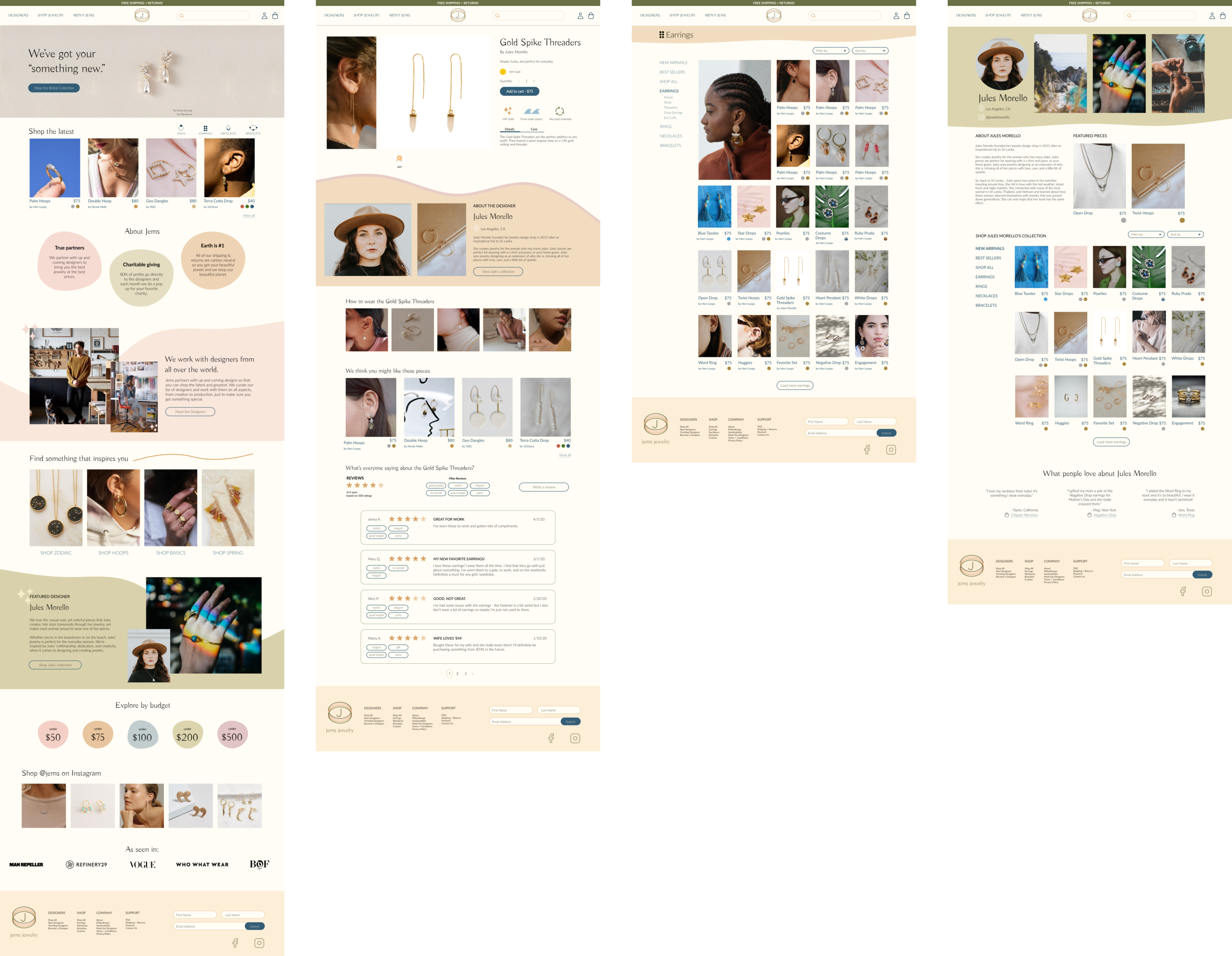
Hi-Fidelity UI Designs v1
Taking the new Jems branding, I designed the hi-fidelity designs for the homepage, category page, product page, and designer page. These core pages serve as the basis for a user’s experience on the Jems site. I wanted to take the branding and translate it in a way that felt natural, yet not too intrusive.
Across the site, I tried to incorporate previously known and used patterns (such as the same grid pattern on the category page and designer’s page) to improve overall learnability for the user and reinforce the fact that you could shop Jems as a whole, but also just a specific designer.
Based on my learnings that users tend to search for a specific type of jewelry product, like when they’re replacing something that broke, I decided to introduce multiple opportunities to find those relevant categories. For example, in the second module on the homepage, a user could tap RINGS to see the 4 latest rings. Additionally, the category tiles later in the page provide a themed entrance point to allow the user to explore more products.


4. Prototype + Test
Overview
Once the v1 hi-fidelity designs were in a good place, I needed to test how the design and overall experience worked in the hands of potential users. I created a prototype to test the flow of the homepage → category page → trip page on desktop. Once in the hands of users, I would then be able to audit any confusion or frustrations with the designs, prioritize changes for launch, and then make those changes to produce the final designs.
- UI Prototype [Desktop]
- Usability Testing Plan + Summary
- Usability Testing Affinity Map
- Priority Changes for v2
- Final Designs
Prototype
I created a prototype for the flow I wanted to test using Figma’s prototyping tool. Users would be able to interact with various aspects of the prototype in order to complete the specific tasks in usability testing.
Usability Test Results
After reviewing notes and transcripts from my usability testing, I began to draw out key actions and quotes from my participants. From there, I used Trello to organize a list (the columns) for each participant. With all participant actions and quotes lined up, I then began to create lists based on the themes that were coming up for more than two participants. This helped me see themes on frustrations in the flow, features or modules they liked, and any pieces of content that might have been unclear. From there, I created an affinity map to see the themes at a glance.

Priority Changes
Based on my usability test and the key issues that came up for participants, I began to prioritize changes for the four pages. Overall, most improvements were small visual changes, i.e. increasing font weight, or adding a feature, i.e. review search and filter functionality, which matched users expectations.
A few key changes were made on the homepage to improve overall user experience, but also to abide by the business goal of getting users on the path to purchase faster.
Take a Look Module improvements

Filter by Module Module Improvements

Final Designs

So, what did I learn?
Creating Jems was a great way to learn not only about e-commerce, but also the world of marketplaces. I really enjoyed the user research of this project and trying to create a digital experience that still connected to the deep nostalgia that women feel with jewelry. It was also a lush landscape to do secondary research in, as there are so many up and coming brands and designers trying to target the modern millennial woman (and her spending habits).
This project was extremely valuable because I got to dive into the design patterns of e-commerce and while I attempted to challenge or create new patterns, e-commerce is something that works and when you mess with it, it’s not always a good idea.
Next steps in this project would be to continue doing usability testing to ensure that the experience allows users to find and purchase designs. I would also like to build out more of a designer community hub and think through what it might look like for designers to apply to sell on Jems, create and manage their stores, and contact consumers.