Creating a responsive travel booking website for a modern brand

The Project
Project Goal
Design a responsive travel booking website that educates potential customers about a totally new service — time travel — from a totally new brand — Zeit. The website should allow users to easily learn about how Zeit works, as well make it easy for users to book a trip. The website and new brand should reflect Zeit’s modernity, with a nod to the historical component of time travel.
Brand Overview
Zeit is a conceptual brand and service around time travel tourism. With over 289 destinations, travelers can experience the past when they travel with Zeit.
Role
Product Design, UX/UI Design, User Research, Information Architecture, Branding, Prototyping, Usability Testing
Tools: Figma, OptimalSort
The Process
1. Empathize
Research and understand how people travel
2. Define
Get into the details of what needs to be built and who we’re building it for.
3. Ideate
Create a brand and website for Zeit based on what we’ve learned so far.
4. Prototype + Test
Test our designs with real users and iterate based on feedback.
1. Empathize
Overview
How do people travel? What about find new experiences to travel to? What types of expectations to travelers have—from booking to arrival?
Building Zeit meant starting with the basics. I needed to get an understanding of how consumers book consumer-based travel. From there, I would dive into frustrations and pain points when it comes to research, booking, and planning travel experiences.
- Secondary Research + Competitive Analysis
- Primary Research: User Interviews + Findings
- Affinity Map
- Persona
Secondary Research + Competitive Analysis
When it comes to booking travel, there are plenty of sites and aggregators that make it easy for users to book everything with one tool; however, not one tool does it so well that it pushes out other competitors.
There are so many opportunities for consumers to learn about experiences and places to go, it can definitely feel overwhelming to someone who wants to just get up and go somewhere.
Through desk research and competitive analysis, I found that experience-based travel is becoming more and more popular. More and more companies are offering experience-based travel opportunities. From Airbnb Experiences to adventure travel tours, consumers have a desire to expand their horizons and be more than just a tourist.

Secondary Research
Summary of Findings
With experience travel becoming a growing trend, travelers want more memories and fewer things. Virtuoso reports that one of the top travel trends for 2019 was experiences with local culture. With luxury travelers taking 3-4 trips a year, there are more and more players in the travel space that can cater to the desire for adventure and culture.
When it comes to direct competitors, companies that offer experience-based travel sell their services by prioritizing an immersive digital experience to promote booking online. They also do a great job at providing detailed itineraries so travelers know what to expect out of their adventure.
Other competitors, such as popular booking sites, boast more “full service” booking systems, allowing travelers to book every part of their trip with the service. This full service model lacks the luxury feel that the immersive experience providers have.
Competitive Analysis + Provisional Personas
Industry Insights
Global luxury travel market is expected to generate $1,614 billion by 2026 (Allied Market Research)
⅓ of luxury travelers choose a location based on social media (Travel Agent Central)
Millennials are 13% more likely to travel to a destination with cultural or historical significance (Responsible Travel)
65% of bookings are made online
With a better sense of how people book travel, I started to build out provisional personas that would help guide the primary research phase of user interviews. These provisional personas include key information about those types of consumers, as well as their goals and pains when it comes to travel.
I looked at some of the top experience-based travel companies, as well as travel booking aggregators to get a sense of the landscape. From there, I took a deep dive into the strengths and weaknesses of each competitor to gain a better sense of how Zeit could set themselves apart.
Primary Research: User Interviews
I interviewed participants who define themselves in the realm of luxury travelers, are aged 30-65, don’t travel with kids, and are solo travelers. The goal was to learn about their traveling flow, from booking a trip to traveling to coming back home. With these interviews, I gauged information on how travelers approach taking a trip to a remote or unknown location to uncover any fears or uncertainties that might give us insight into how they’d approach time travel.
- 5 participants
- 4 female, 1 male
- Age range: 31-60
- All participants were active travelers (remote workers, travel for work, or take 4+ trips per year)
User Interview Findings
Goals + Needs
Users want immersive experiences.
Users want value for their money.
Users want visual inspiration.
Motivations
Trips are better when you don’t have to plan them.
Users want to use their time wisely.
Pain Points
Users want trustworthy sources.
Users have high expectations.
Users think that planning can be a pain.
Opportunities
Live like a local did.
Get into another world.
Mystery trips.
Affinity Map
Upon reviewing transcripts from my user research, I began to draw out key quotes from each participants. From there, I used Trello to organize a list (the columns) for each participant. With all participant quotes in the board, I then began to create lists based on themes that were popping up for at least two of my participants. From there, I created an affinity map to see key themes across the board.

Participant quotes by theme

Affinity map based on key themes
The Persona
Thinking about the offering of Zeit — a super unique travel experience that would cost thousands of dollars per person — and the learnings from my interview, I began to develop a persona to serve as the focal point of my designs. After learning that participants who are likely to spend money on travel are more likely to hand over some element of planning to someone or a service, I decided to opt for a persona of a working mother living in an urban area who doesn’t have the time to plan family vacations, but enjoys and values traveling.
I’d like you to meet Jenni!
Click to enlarge
2. Define
Overview
Using my research as a base, I began to develop goals and priorities for how the site would function and how users would interact with Zeit’s digital experience. Defining these pieces helped me create a holistic approach before tackling UI design.
- Project Goals
- Feature Roadmap
- Card Sorting Exercise + Summary
- Sitemap + Information Architecture
- Task Flow
- User Flows
Project Goals

Now with a better understanding some of the user goals through user research, I began thinking through business goals based on the project brief.
What were some of the business requirements and limitations?
How could the website support the business revenue?
What are some expectations that users have from a business?
I also looked into some technical considerations that would impact the development of this booking site in order to keep in mind accessibility, potential integrations, and future updates that would have to be made to the site.
Feature Roadmap
Taking into account feature expectations from a user’s perspective, I began thinking through the features of the website and how they would have to be prioritized based on must-have, nice to have, a way to surprise and delight, and can come later.
Organizing the features into these buckets help me tackle the most important pieces of the site first before diving into features and components that were not backed up with research.

Card Sorting Exercise
Overview

Similarity Matrix for Zeit Card Sorting Exercise
To get a better understanding of how people categorize information related to time travel trips, I conducted a card sorting exercise. This exercise asked users to organize cards with potential Zeit time travel trips on them into different categories that they created themselves.
Online card sorting
Open sorting study
9 participants
30 card variants
All cards were examples of Zeit trips, such as:
Beatlemania, 1963
Plato's Greece, 368 BC
Building the Eiffel Tower
Findings
The card sorting exercise showed that people think about events and periods of history very differently. Some participants had some fun with categorizing the cards and created unique groups based on personal opinions, such as ‘Influential Moments’ or ‘Modern History Gone Right.’ From Zeit’s perspective, organizing historic periods and events from a subjective point of view likely wouldn’t garner and trust from potential customers.
The category distinctions made that were useful were more centered around where the event took place (i.e. a destination or location) or a particular interest/theme of the event (i.e. arts and culture vs. history). These two categories, locations and interests, were much more objective and would allow for a natural sorting pattern for all of the possible trips.
I decided that the Zeit site would offer two distinct categories: Destinations and Interests. The destinations would be different locations where customers could travel to that was organized by continent. Further in the process, a user could filter by specific regions, countries, or even cities (depending on how many trips were available). The second category, Interests, would allow potential users to filter by a theme and provide an opportunity for discovering new places just based on a topic one was interested in.
Sitemap
With learnings on how potential users categorize potential time travel destinations as well as insight from secondary research, I was able to create a sitemap for Zeit. The sitemap includes some of the key elements of a travel booking site — Search, Account, Cart, Help — but also incorporates educational pages of About and How it Works so that the user has a way to learn more about Zeit and the technology behind time travel, thus building up their trust in the service.
In order to make it easier for users to find trips that fit their interests and ideal location, I split organized the trip pages under Explore, further divided into Destinations and Interests. Each trip would then fit under the subcategories that applied.

Task Flows

These task flows think through how a user might land on the Zeit homepage and navigate through the site. This task flow relies heavily on the Trip Finder to lead a user’s search flow and guide them to the trip plage.
This task flow also has preliminary booking flow that lets users enter the dates and number of travelers before the user adds the trip to their cart. The full booking flow would then allow the user to enter traveler details, select add-ons, and ultimately purchase their trip.
User Flows
Based on the Zeit persona and potential customers, I built out two potential user flows through out the site featuring the persona, Jenni. In these two user flows, Jenni is on the early side of education and discovery of Zeit. The user flows show the possible journey Jenni would have through the Zeit website and how she might save the site to return to later or share with relevant members of her travel group.
These user flows help clarify the following goals:
Where a user arrives on the site from
How a user interacts with the site
How a user revisits the site
The length of time to conversion
Click to enlarge
Click to enlarge
3. Ideate
Overview
Using insight gathered from the user research and the goals and priorities outlined in the Define phase, I began to create parts of the Zeit website and brand. I began by creating sketches for the homepage, thinking through how the Zeit story and education of the brand would come through on the homepage, while still focusing on the primary goal of getting users to book a trip.
From there, I took the final sketches into responsive wireframes to get a better understanding of how the content could fit within the grids for each screen size.
Once I had the wireframes in a solid place, I took a step back to create the elements needed to brand Zeit and finally translated the branding to responsive UI designs.
- Sketches
- Responsive Wireframes
- Branding + UI Kit
- Hi-Fidelity Designs
Sketches: Homepage
In sketching the homepage, I played around with different navigation patterns, as well as different ways to organize the key elements of the homepage. The homepage serves as the primary entry point for users and must be a place that educates, creates a desire within the user, and inspires them to discover the brand further, whether that means diving into a trip page, searching for something, or learning more about Zeit and the technology itself.


Refined Homepage Sketch
The refined homepage sketch that I landed on featured a left-hand navigation that would scroll with the user and be ever-present for the user. Using this type of nav felt more experiential and less classic e-commerce. I felt it would be something that could set Zeit apart from the traditional experience tourism site.
The homepage sketch also features a lot of education modules, allowing the user to learn more about how Zeit works, the trips available, the trip guides, and a specific highlighted trip (Atlantis). I wanted the user to feel immersed in Zeit after visiting the homepage and inspired enough to keep searching through the site.

Responsive Wireframes
In refining the homepage sketches into responsive wireframes, I decided to take a more minimal approach. I slimmed down the amount of modules so that it was still immersive, but not overwhelming. I simplified modules, such as How It Works, so only key information was surfaced.
Finally, I decided to design with a traditional top navigation because the left-hand navigation would have been more difficult to learn, thus potentially resulting in site abandonment or frustration on the user’s side, and then a lost of revenue from the business’ perspective.

Branding + UI KIT
In order to move forward into UI design, I began to create the Zeit branding. I drew inspiration from vintage travel posters with bright colors — these posters represented a nod to history and an aspect of nostalgia that I felt would resonate with the intended persona.
Brand Goals:
Feel modern, yet approachable
Family friendly
Trustworthy


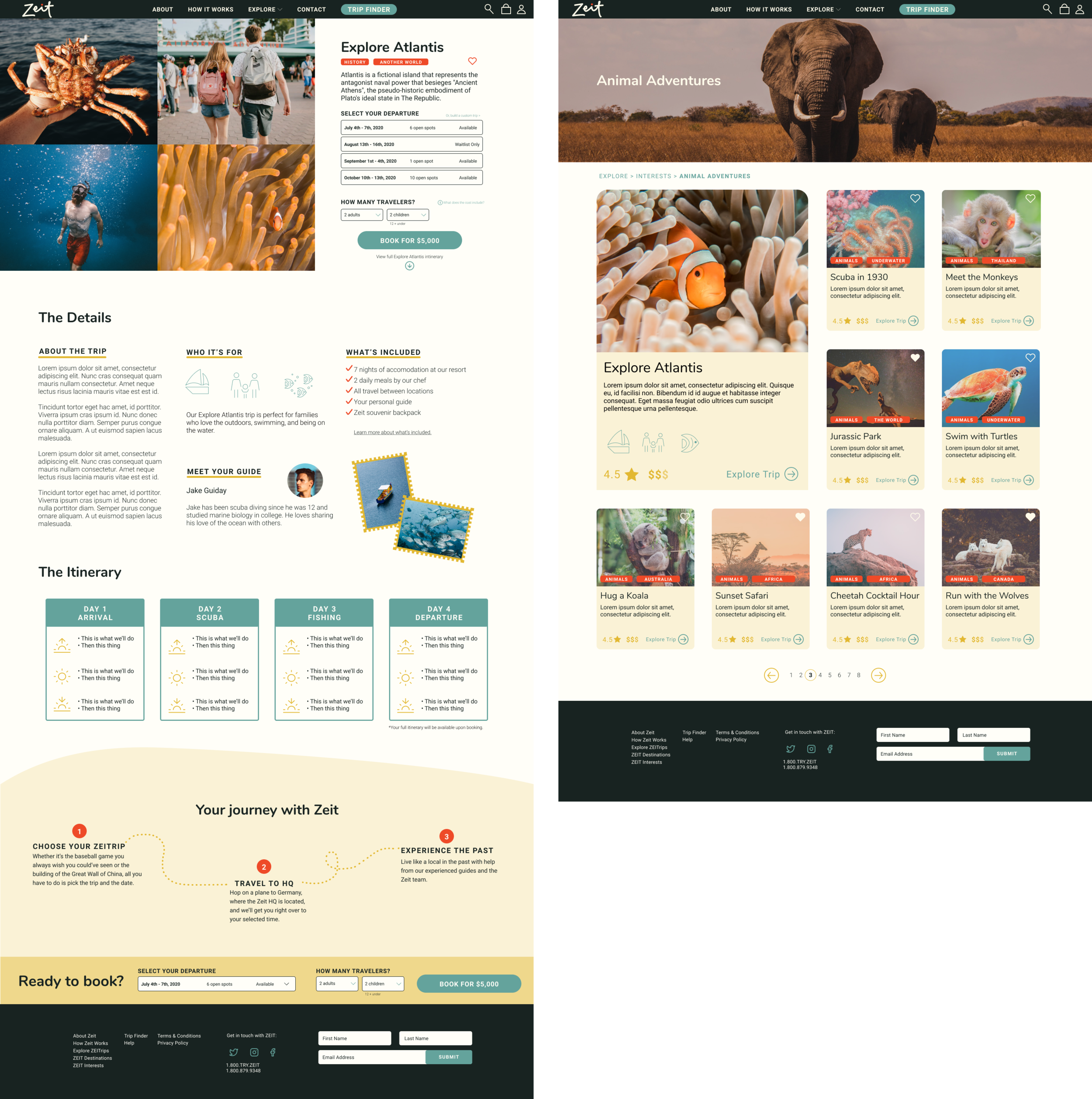
Hi-Fidelity Mockups
In creating the hi-fidelity mockups of the Zeit homepage, category page, and trip page, I returned back to the goals of educating the user on Zeit, immersing the user in content about the trip, and making it easy for them to find and book a trip that was a good fit for them.
In returning to the persona and branding, I aimed to balance modernity, nostalgia, and playfulness. I wanted this design to nod to the technology — time travel is no so feat! I also wanted this brand and experience to appeal to adults and the kids they might be taking on this trip with them, whether the children were 5 years old or 25 years old.

4. Prototype + Test
Overview
Once the v1 hi-fidelity designs were in a good place, I needed to test how the design and overall experience worked in the hands of potential users. I created a prototype to test the flow of the homepage → category page → trip page on desktop. Once in the hands of users, I would then be able to audit any confusion or frustrations with the designs, prioritize changes for launch, and then make those changes to produce the final designs.
- UI Prototype [Desktop]
- Usability Testing Plan + Summary
- Usability Testing Affinity Map
- Priority Changes for v2
- Final Designs
Prototype
I created a prototype for the flow I wanted to test using Figma’s prototyping tool. Users would be able to interact with various aspects of the prototype in order to complete the specific tasks in usability testing.

Usability Testing
To fully understand how the designs functioned in the hands of the user, I organized usability tests (both remote and in person) with 5 different participants. Each participant was asked questions surrounding the site’s value prop, as well as asked to complete tasks on the site.
Test Goals
Test ease of use of navigation
Test value prop and understanding of Zeit and the trips offered
Observe any frustrations or confusion
Participant Overview
5 participants, 2 female + 3 male
Ages: 18, 34, 60, 61, 62
Type: Travelers who plan or go on a trip 2-3X per year and travel with their family ~50% of the time
Findings
Task Completion Rate
Understood Zeit’s service - 20% of participants
Found Animal Adventures category page - 60% of participants
Found Explore Atlantis trip page - 100% of participants
Understood booking process - 80% of participants
The usability test uncovered a few main areas to develop within the site design:
Participants didn’t fully understand that Zeit offered time travel trips, but understood it was travel-related
There are multiple ways for finding or searching for a trip
The trip page is clear; however, could include more details on accomodation, guides, etc.
Participants were confused on if their Zeit trip included air travel to the Germany HQ
Affinity Map
After reviewing notes and transcripts from my usability testing, I began to draw out key actions and quotes from my participants. From there, I used Trello to organize a list (the columns) for each participant. With all participant actions and quotes lined up, I then began to create lists based on the themes that were coming up for more than two participants. This helped me see themes on frustrations in the flow, features or modules they liked, and any pieces of content that might have been unclear. From there, I created an affinity map to see the themes at a glance.

Participant quotes by theme

Affinity map based on key themes
Priority Changes
Based on what I learned from my usability test participants and the key themes that came up for participants, I made a list of the most crucial changes that would have to be done to the Trip Page and Homepage. These changes were prioritized based on what I believed could be done prior to launching the site from a development perspective and focused mainly on content updates to clarify Zeit’s service and lean more into the immersive, yet educational goal of the site overall.
Homepage
Showcase different trips earlier on the page
Change hero image
Add CTA for why to add email address to footer
Trip Page
Add share button
Add FAQ link or section
Add info on booking flight to HQ
Update itinerary to include arrival / departure time
Add testimonial section
Remove how it works / your journey section
Add accomodation details
Change book trip CTA copy
Update departure section to be a drop down
Final Designs
Mobile Prototype
Final Responsive Designs

Project Summary
Working on Zeit was a challenge, yet really rewarding to see all come together. Working on a service that doesn’t exist today forced me to ask and answer many questions myself — Would participants still have access to a cell phone when they traveled? How would the guide interact with these people and how could I portray that relationship? I found myself second guessing a lot of design decisions that might have been much more straightforward if I was designing for a cruise line, for example.
The Zeit project was a valuable experience because it taught me how to dig deeper into user behaviors around travel and planning in general, rather than be able to rely on a type of travel habit or experience that already existed. I learned so much about how people research, plan, and book trips and the frustrations and desires that come with travel planning for one’s family. In my opinion, there’s still so much to learn about travel habits that could really improve both Zeit’s online and offline experiences.
Next steps in this project will be to build out the Trip Finder functionality in the prototype to test user confidence in this type of search and education experience. Usability testing at this point would be crucial in moving forward with this feature or iterating to find a new way to surface both information on Zeit as a service, as well as trips that would fit the user to really lean into the personalized experience I was aiming for.